Last time, we looked at the Australian market and what property portal apps consumers looking for real estate in that sector have to work with. This week, we skip over to the UK, a market with many competitors except when it comes to how many of them offer their services in app form.
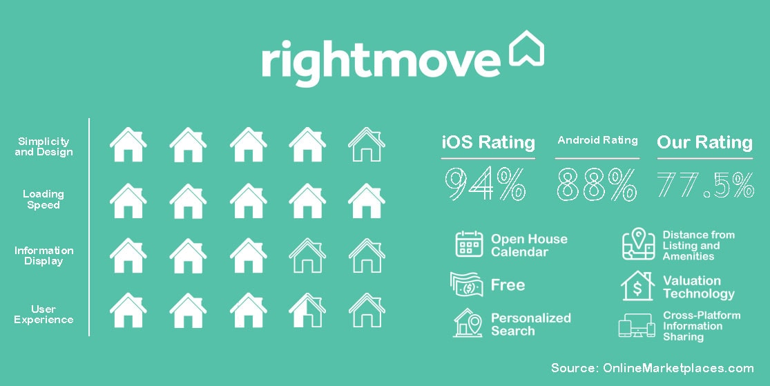
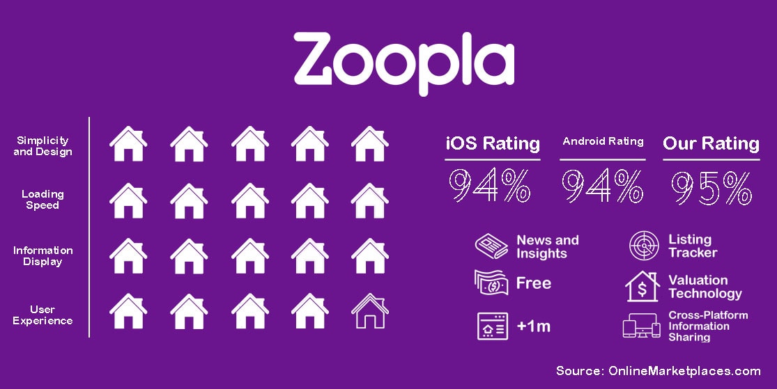
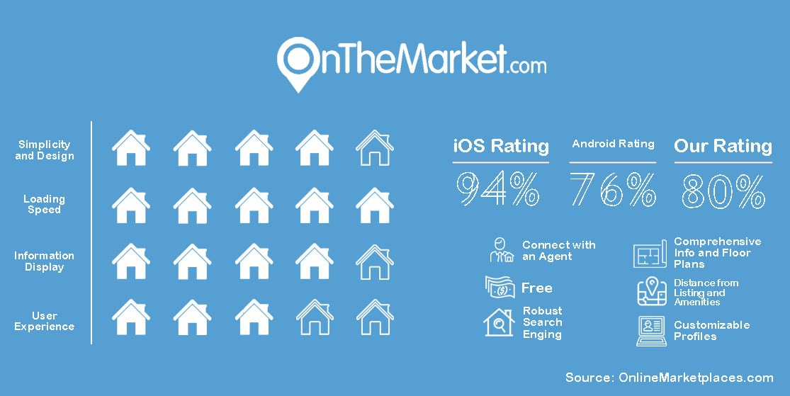
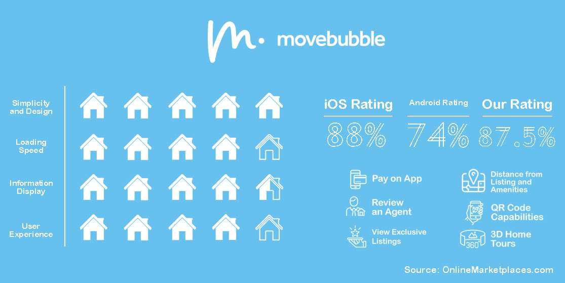
We found, when looking at the few that do, in fact, offer a mobile app along with a desktop version, Rightmove is the most popular, Zoopla is the best overall, OnTheMarket offers listings faster than its competitors, and trendy Movebubble has the most potential.
| wdt_ID | Company | Simplicity and Design (%) | Loading Speed (%) | Information Display (%) | User Experience (%) | Apple Rating (%) | Android Rating (%) | Our Rating (%) | Total Average (%) |
|---|---|---|---|---|---|---|---|---|---|
| 1 | Rightmove | 80 | 100 | 90 | 70 | 94.0 | 88.0 | 85.0 | 89.0 |
| 2 | Zoopla | 100 | 100 | 100 | 80 | 94.0 | 94.0 | 95.0 | 94.3 |
| 3 | OnTheMarket | 80 | 100 | 80 | 60 | 94.0 | 76.0 | 80.0 | 83.3 |
| 4 | Movebubble | 100 | 80 | 90 | 80 | 88.0 | 74.0 | 87.5 | 83.2 |

Hailed as the most popular property portal in the UK, Rightmove offers a number of necessities for both agents and regular consumers looking to buy, sell, or rent a property. Everyone in the UK knows of this platform with brand awareness through the roof. Rightmove's website holds all the belts within the UK market, but does its app keep up?
The iOS version of the app is optimized for the iPad, including capabilities that work with iPad-specific features. The app is organized a little differently from U.S.-based apps. It’s less minimalist when it comes to information on the home page.
But users can do basically the same thing as with Zillow’s app - especially since Rightmove added a feature that allows prospective buyers to schedule viewings and offers a place to organize tours and virtual tours.
For added convenience, the Rightmove app allows users to sync all versions of their account so they can access saved listings and the open house calendar anywhere.
The app is popular with Apple users. Though one angry reviewer pointed out something that we noticed while poking around the app ourselves. They compared it to Zoopla, saying the UI, which is particularly cluttered for a modern app, is hard to navigate whereas Zoopla has a much more minimalist look.
Another recent review pointed out that the app doesn’t allow users to save types of properties to optimize the search experience.
As usual, Android users are a little more critical. One user pointed out the same issue where the app doesn’t save types of properties, another pointed out that it’ll still show listings of types of properties that they have already selected to filter out.
More often than not, the devs are actively replying to both poor and five-star reviews. Hopefully, that means the Android version is actively improving.
We like Rightmove. It’s so popular for a reason. And while the platform itself is known for its importance to the UK market, the app could use some cosmetic improvements. Compared to the other apps we’ve reviewed thus far, Rightmove’s is the most cluttered, with ads on the bottom. Though when it comes to the information displayed in the list of properties for rent or sale, the app shows only the most important aspect of a property including price, how many bedrooms, the agent, and whether there is a floorplan available to view or not.
However, we know that Rightmove is at the top of the market when it comes to popularity in the UK. More people search Rightmove than its competitors by a huge margin. Even a quick Google Trends search shows that when compared to Zoopla (which has more reviews on the Apple Store than Rightmove), the distance between traffic is staggering.

Particularly more popular with Android users than Rightmove’s app, Zoopla’s app has high ratings, indeed. The overall look of the app is intuitive and minimalist. The app has a tracking feature that keeps tabs on a user’s home price and offers real-time notifications for property updates.
Zoopla touts itself as having more real estate data than“anywhere else,” and as being the most reliable way to hunt for a home.
With a section for market news and insights, valuation technology, and over a million listings, Zoopla arms its users with enough information to allow for confident decision-making when it comes to all things real estate.
With the Zoopla app, users can search for listings both in the UK and internationally, compare housing prices anywhere in the UK, and keep up to date with their own house price estimates. Zoopla offers real-time property update alerts and a way to favorite listings to quickly access at any time, from any version of Zoopla.
Its Apple rating is par for the course. A couple of ornery users recently complained about valuation estimation, both chalking the issues up with the fact that the data is old or misleading. Other recent comments point out improvements that could be made for certain features, like optimizing the map view feature, better filter options and capabilities, and better integration between the Zoopla app and desktop versions.
Android users love it more than they love Rightmove’s app, apparently. Browsing through the reviews on the Google Play Store, most of the recent ratings are five stars. The poor ratings seem to be situational due to glitches and bugs that need to be fixed.
The app looks great, especially after its recent rebranding and UI and UX overhauls. Now, when inputting all search filters and criteria, there is a scrollable section for property types ranging from detached to park homes represented by cute icons of each property type.
Something that sets the app apart from the others reviewed is that in each search result, there is a banner that says how recently a listing has been set up, for example, Zoopla will show the most recent first as a default and those listings sport a bright yellow banner that says ‘Just Added’ at the top.

OnTheMarket claims to receive listings a full day before competitors Rightmove and Zoopla. When it comes to viewing a listing, OTM listings have detailed information that can be viewed before a prospective buyer decides to visit the property, including Google Street View capabilities.
Users can also see what kinds of amenities are close to a listing, including schools, public transportation, and more.
When flipping through a listing’s details and photos on full screen. Users can also read through all property details and floor plans of a listing and contact an agent quickly and easily all in one place.
The app also allows users to share a property they’re interested in across all social media platforms and browse through the latest real estate market information to equip themselves with enough knowledge to make better decisions when it comes to buying, renting, and selling property.
Besides a short time earlier this year where many reviewers complained about every listing being labeled as ‘no longer on the market,’ Apple users are pretty pleased with the overall app. One thing that sticks out while working on this review series is that apps have an issue with showing listings outside of a user’s selected search criteria. Is this situational or are there bugs within algorithms that app developers are ignoring?
The most recent Android reviews are less than desirable. Many say they are either going back to using the desktop version or choosing Rightmove to continue their search, instead. The issues range from UI glitches to broken links to not enough listings. One user explained that they have to reset their search criteria every time they use the app. More have complained that the filters for the search engine reset randomly or just don’t work.
That being said, the devs are quick to respond. Here’s hoping the Android version of the app continues to improve.
We noticed that the more filters added to a search, the less likely any properties will show up at all. This was tested using a number of UK towns compared with both more and fewer filters applied to the search- something that didn’t happen on Zoopla or Rightmove.
Does this mean OTM, even though it claims to offer listings faster than its competitors, has fewer listings to offer because of that? Would it be worth it to use OTM then when there is a seemingly larger pool of listings to choose from on other platforms? Or is this just situational?

Some apps use niche markets to get their feet into the market and compete with the big names. One such is Movebubble which focuses exclusively on the rental market of the UK. And real estate apps don’t get more niche than Movebubble. Currently only available for properties in London and Manchester, the app holds its own when it comes to mobile applications.
With the Movebubble app, users can search for space to rent with the help of virtual tours, how far a listing is from different amenities, and pay for it via the app itself.
Through the desktop and app (which look strikingly similar, Movebubble is more app-centric than other property portals, especially ones from the UK), users can rate and review the agents they worked with and have the added bonus of seeing listings that are exclusive to Movebubble, something that puts it ahead of other rent-focused apps within the same market.
To download the app, just take a picture of the QR code on the homepage of the desktop version.
It doesn’t have many written reviews, but the ones with low ratings are situational and due to bugs after updates. One reviewer commented that they didn’t like the rotating image feature, but we thought it was a cool touch. Movebubble seems to be honing in on a younger market, and now, the oldest Gen Z's are beginning to look for space to rent. Apps should be keeping up with the latest trends, especially when it comes to attracting as big of an audience as possible.
Many commented on how easy the app is, stating they will gladly trade price for how quick and friendly the agents and customer service are. Another reviewer did mention the rotating images feature, comparing it to TikTok and giving the app a poor score because of that. Movebubble’s design is trendy and works very similarly to social media apps - perhaps because it’s aimed at a younger demographic.
Movebubble is hip. Its interface feels like a trendy fun app as opposed to the down-to-business feel of most property portal apps. And that is definitely the point. The desktop version advertises the app before it advertises its own services, hoping users will default to its app and grow its mobile audience.
The downfall to this app is that it is only available in two markets, making it a kind of left-fielder when it comes to why it was added to this review in the first place. The UK market, at least from a foreigners perspective, doesn't have many of its property portal apps available for those without a UK phone, it seems. Either that or they just don't have an app available yet. Movebubble is honing in on this obvious lack in modern technology, going overboard with its app's capabilities and design.
Either way, playing around with the app itself is fun!
All opinions were made using the iOS versions of each app. Any information on the Google versions of the apps was taken from reviews made by Android users on the Google Play Store pages for each app.