We recently spent a lot of time looking at every single property portal website in the world (there are over 650 of them) for an Online Marketplaces study into which features are industry standards and which are still avant-garde.
Having spent so much time looking at property websites, we developed favourites and came to have some strong opinions on what was annoying about some of them - so we did what any good content creator would do and made a list of our pet property portal peeves.
Sometimes there is a lack of data and so a portal company just can’t help it. Sometimes it seems they are favouring their customers over their users. Other times there just doesn’t seem to be a logical explanation other than the Product Manager not getting the resources or a company just being obtuse. In any case, we’d like these things to die out.

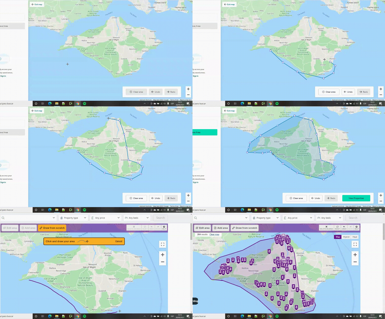
We started to see that there are two different generations of the ‘draw your own search’ feature. A lot of portals that have this feature make you move a series of triangulation points over a map rather than truly draw an area - looking at you, Rightmove! This is really annoying and frequently leads to errors.
A lot of sites seem to think that renters are a different breed to those who are looking to buy and have structured their portal to essentially be two different websites - one for sales and a separate one for rentals. Switching between rental and sale listings on one of these websites is an involved process which often means inputting your search criteria all over again.
The feature we didn’t know we needed that now we can’t do without. Maybe the portals that don’t have this feature are bragging to their agent customers about the pageviews that their listings pages get. We noticed that on a lot of portals that don’t have this feature that the first photo on listings is much more likely to be click-bait.
It’s obvious that this is to dissuade window-shoppers (or maybe nosy journalists who want to see exactly how many listings a portal has) but window-shoppers / journalists are people too… Just let us click ‘search’ without giving an area, please.
As I’ve written about before, the keyword search tool (and its cousin the keyword exclusion tool) are very useful and underrated features. Put them front and centre and use the tech behind them to make long-tail URLs for your SEO.
More common than you’d think and really annoying when you’re working in a public space and don’t have your headphones plugged in.

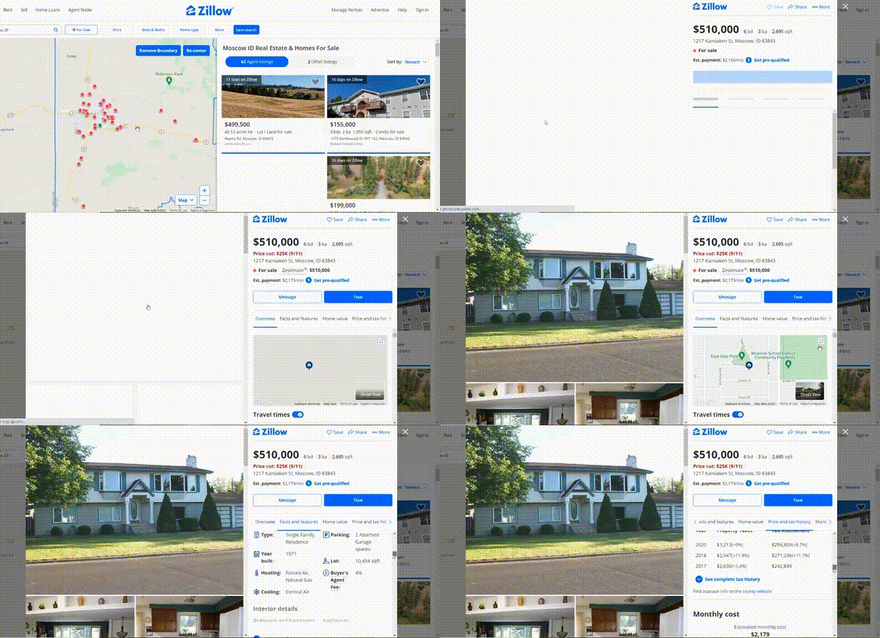
I know that the listing has its own URL and that all the information is on there but I still hate it. Zillow is the biggest culprit here but others such as Zumper have gone down the same route. It takes away from all the valuable information that you have to scroll down on a reduced screen size to view.
Who needs to see a tiny corner of the map and the other listings. Maybe it’s to encourage the user to keep browsing rather than to engage them on any one listing - I’m sure these portals have done a lot of A/B testing and have a tremendous excuse for it but I still hate it.
Two schools of thought here, the Zillow ‘customer is the north star’ approach, also championed by ex ImmoWeb CEO Christophe Rousseaux who on a recent vodcast interview told us: "A lot of portals do what the real estate agents want and that, for me, is a big big mistake" and the other lot.
We’re with Christophe and Zillow on this one. I don’t want to pay a month’s rent to an agent for uploading a portal listing and neither does anyone else - let me filter them out!
Sometimes, especially in emerging markets, there is a lack of data or a technical debt that stops portals from being able to place their listings on a map. In other cases, they seem to just be being difficult.