
Last month we published an in-depth look into the competition between two of Spain’s biggest property portal apps-- idealista and Fotocasa. When it comes to the number of consumers using each app, idealista and Fotocasa are neck and neck and locked in a PR war to promote their respective apps.
But they're not the only options for those looking to buy, sell, and rent property in Spain. In this review, we look at not only these two Spanish property portal apps but two more that offer users a market-leading experience-- Spotahome, which we've compared with other property portals before, and pisos.com.
We've found that idealista has the best inventory and highest average rating overall. Next is Fotocasa, its biggest rival. Fotocasa competes with the help of the most innovative features for searching, buying, renting, and selling property. Fotocasa is followed closely by Pisos.com, which focuses on smaller markets but gets the job done. Last, is Spotahome, an app that is highly used by ex-pat renters and perfect for foreigners to find housing in Spain.
| wdt_ID | Company | Simplicity and Design (%) | Loading Speed (%) | Information Display (%) | User Experience (%) | Apple Rating (%) | Android Rating (%) | Our Rating (%) | Total Average (%) |
|---|---|---|---|---|---|---|---|---|---|
| 1 | Idealista | 100 | 100 | 90 | 80 | 96 | 92 | 95.0 | 93.0 |
| 2 | Fotocasa | 100 | 90 | 90 | 100 | 94 | 86 | 95.0 | 91.0 |
| 3 | Pisos.com | 100 | 100 | 80 | 70 | 96 | 88 | 87.0 | 90.0 |
| 4 | Spotahome | 90 | 90 | 90 | 90 | 90 | 72 | 90.0 | 84.0 |
And as an added bonus, we've read through the reviews made by users for all four apps, so you don't have to.
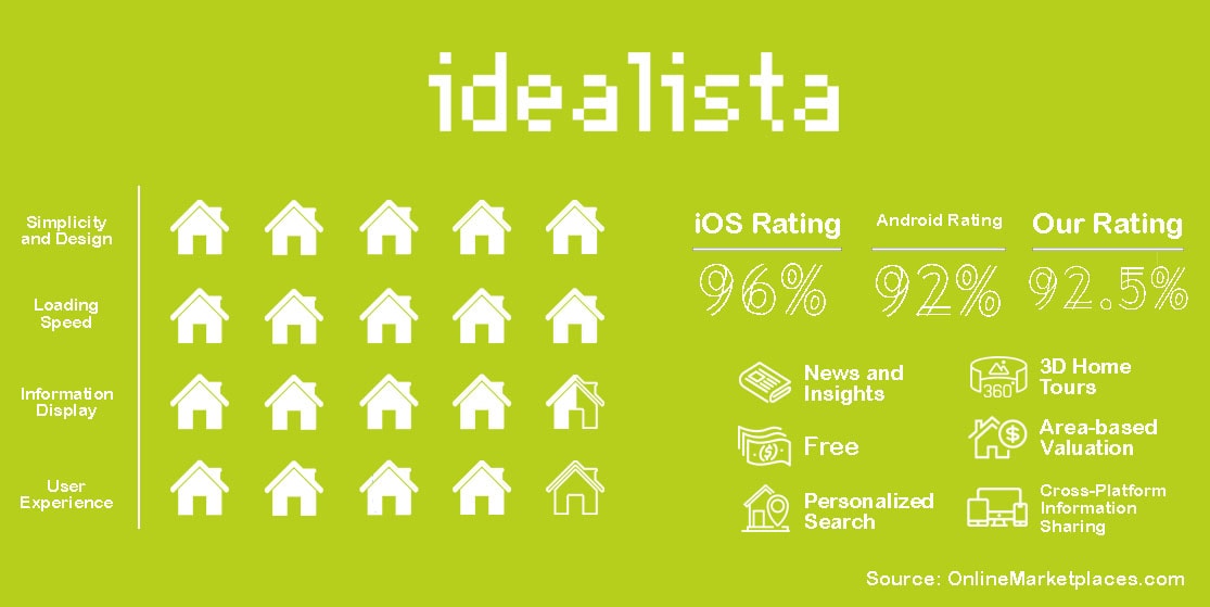
There’s a very good reason that idealista is at the forefront of Spain and Portugal’s real estate markets. The app is simplistic and offers 3D floor plans, Google street-style walk-throughs, and a special feature that allows users to peruse house prices wherever they are.
Through the idealista app, users can easily share their favorite listings between social media platforms. In fact, information sharing is, like many modern real estate apps, ever-present on idealista mobile application. There is a section for news and insights to help users make more informed decisions when it comes to buying, selling, or renting a property.
It’s not surprising that idealista’s app is popular. Apple users say that there are few glitches, and when bugs show up, the development team is quick to fix them.
Android users, whether they are just pickier or if Android versions of apps are less developed than their Apple counterparts, are quick to point out bugs. Looking through their reviews, idealista’s development team has replied to almost every complaint, a show of how they listen to their consumers and constantly enhance their app accordingly.
It is paramount that an app is easy to use-- something idealista has definitely capitalized on. The design is simplistic and the app is easy to navigate. Being from an English-speaking country, the app was automatically in English with no need to change the language, though the listings themselves are in Spanish with no way to translate them through the app. In that way, the desktop version of the platform would be necessary for non-Spanish-speaking users.
Looking into the analytics, the gap between how many people search for 'idealista' and how many people search for its rival 'fotocasa' on Google is staggering. This is most likely due to inventory quantity as well as quality. Idealista's inventory is huge, seeing that it spans to markets outside of Spain. This gives it a leg up on the competition.
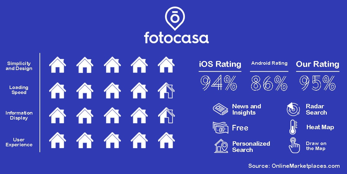
Fotocasa is another big name within the Spanish market. Having an ongoing rivalry with idealista, Fotocasa has a few tricks up its sleeve to set it apart from its competitors.
One feature we found interesting was the heat map. The service offers a visual representation of the cheapest areas when it comes to buying and renting property.
Another feature that utilizes the touchscreen aspect that comes with having a mobile device is the ability to draw on the map to select an area of interest. Looking for property between two towns? Just use your finger to make the exact shape to cover the specific area you’re wanting to move.
Working along with these specialized map features is Fotocasa’s Radar Search capability which alerts you when a property meets specific criteria hits the market. And as an added way to organize, you can save properties you like and discard properties you don’t like, and keep them from flooding your feed as you scroll.
Apple users love it. The bad reviews are based conditionally on specific issues that pertain to how a seller wrote out a listing. Other than that, the ratings are high, and both English and Spanish speakers alike have little issue with how the app is run.
Android users have a few complaints about how the app works. There are a number of complaints about the drawing feature for the map. Some have said the feature doesn’t work, others say they still get listings outside of where they drew on their feed. These complaints are as new as a couple of months ago.
Drawing on the map is fun. Our phones and tablets are touchscreens, so why not utilize that? Fotocasa allows users to draw the area they're interested in right on a map and then fills the feed with listings within that parameter. The Heat Map is also a neat feature, great for comparing prices in order to list your property for the best price on the market. Fotocasa is definitely at the head of the innovation race within the Spanish market. But is it enough to close the gap between it and idealista?
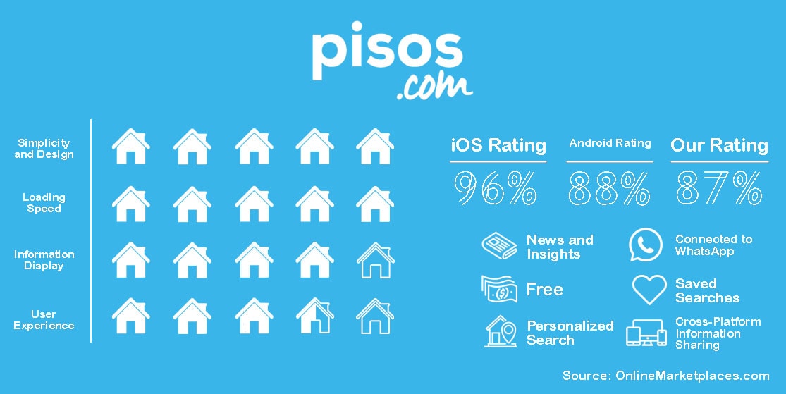
Boasted as a truly transparent platform without the need for fine print, Pisos.com has been helping those in Madrid and Barcelona since 2009. The platform and its mobile applications have all the features needed to help those looking for rent or purchase an apartment, home, or office.
Through the Pisos app, users can find properties for rent or sale around them, select specific criteria for properties and narrow down searches to easily find the best match. Once a listing has been selected, users can get in touch with an advertiser to continue the renting or buying process.
On the app, there is a section for saved listings, and the lists are automatically connected through a user’s account and can be accessed on both the app and the website.
The app offers push notifications to users so they can be alerted as soon as a change is made to a listing or they’ve received a message. The search history is also saved for easy access.
Strangely enough, there aren't very many reviews for the app on the iOS Store. In fact, there hasn't been a review posted since 2018. Still, the app has been rated 512 times since its launch with 4.8 out of 5 stars.
Pisos doesn't have a bad rating on the Google Play Store. There are reviews that compare it to Zillow. Most of the reviews say that the app is adequate. The bad reviews seem to point at compartmentalized instances, like listings being deleted without the lister's consent, or that new listings don't show up on a user's feed even if the criteria for 'new only' is selected. All-in-all, a solid app for Android users.
Pisos.com is barebones. It's simple and straightforward but doesn't have very many features that have become popular with most property portals and their mobile apps. One thing we did notice is that one of the contact options for advertisers on their listings is via WhatsApp. Other than that, the information on listings is minimal-- how big a flat is, how many rooms, amenities, along with photos the advertiser uploads themselves and a blurb about the space.
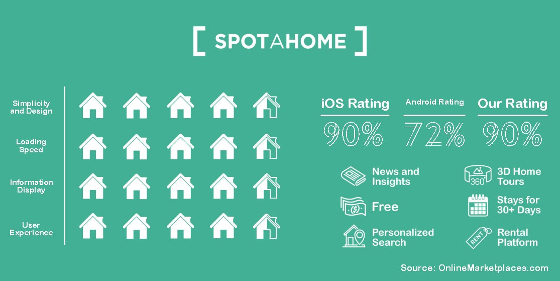
Though Spotahome is strictly for rentals lasting 30 or more days, it’s a staple in Spain and throughout Europe. The pull is how it connects tenants and landlords by breaking through language barriers.
Spotahome offers a way to rent a property without needing to see it in person. Another pull, especially after the COVID crisis. Each listing has floor plans, 360 tours, and extensive photographs and video.
Furthermore, every listing is checked by a verified Homechecker. The Homechecker takes all of the video and photographs that will go to the listing on Spotahome’s platform after going through Copywriters who add in-depth descriptions of the property. These descriptions span from the interior of the space to the feel of the neighborhood it sits in, giving users a virtual viewing that is just as good as if they were to visit the space in person.
For Apple users, they either love the app or hate it. There is hardly an in-between. The bad reviews seem to be conditional, while the five-star reviews, which are the vast majority, have no qualms and are pretty happy with their experiences.
The Android rating is very low, the lowest we’ve seen while researching for this series thus far. The one- and two-star reviews complain of glitches and slow loading speeds. Some claim the spaces are more run-down than how they look on the listings. Some have also claimed that the spaces are shoddily repaired. There are many comments worrying about the app glitching horribly after updating it.
If you’re an Android user, take caution if you plan on using Spotahome’s marketplace’s mobile version. At least until Spotahome addresses these issues.
While we can't check how the spaces are in person, we have to take them at face value. The loading speed is slower than the other three apps we've reviewed here. And the information is just so, with the same issue as idealista, where some listings show up in Spanish, even if you have the language set to something else. But, compared to Pisos.com, there are more features to utilize, though that doesn't help it compete with idealista or Fotocasa.
All opinions were made using the iOS versions of each app. Any information on the Google versions of the apps was taken from reviews made by Android users on the Google Play Store pages for each app.