
Last time, we started our new Property Portal App Review series by taking a look at the Spanish market and the top five apps that run the show.
This week, we look at the biggest property portal apps in the United States, comparing their features and offering the average review from their Android and iOS user bases so you don’t have to search them out.
After doing some research we found that when it comes to the most popular property portal mobile app, it’s hands-down Zillow. When it comes to our personal favorite, we gave the reward to Redfin. Under that is Zillow's Trulia property portal mobile app, as it is everything its parent company's app is and more. Realtor.com gets the job done, and iOS users seem to like Homesnap the most.
| wdt_ID | Company | Simplicity and Design (%) | Loading Speed (%) | Information Display (%) | User Experience (%) | Apple Rating (%) | Android Rating (%) | Online Marketplaces Rating (%) | Total Average (%) |
|---|---|---|---|---|---|---|---|---|---|
| 1 | Zillow | 100 | 100 | 80 | 90 | 96 | 90 | 93 | 93.0 |
| 2 | Redfin | 100 | 100 | 80 | 100 | 94 | 92 | 95 | 93.7 |
| 3 | Trulia | 100 | 90 | 90 | 100 | 96 | 90 | 95 | 93.7 |
| 4 | Realtor.com | 100 | 80 | 90 | 80 | 94 | 90 | 88 | 90.5 |
| 5 | Homesnap | 100 | 80 | 80 | 70 | 96 | 86 | 83 | 88.2 |
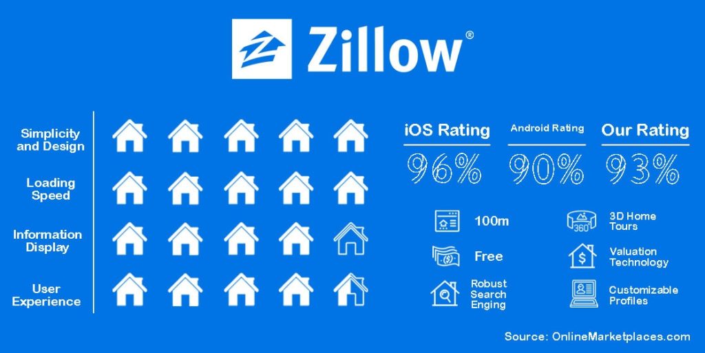
It's no surprise Zillow has the most popular real estate app in America. With its popular and trusted valuation feature, Zestimates, it's the go-to app for the average American.
With over 100 million listings on its platform to date, Zillow claims its listings are unique and only found on its own platform. Even looking at the numbers through Google Trends, Zillow is the most popular real estate portal in the U.S. by a landslide.
Still, the app offers the usual features that come with most apps, like push notifications pertaining to the latest listings meeting a searcher’s criteria. Zillow also offers 3D home tours which have only jumped in popularity in the last year.
Prospective buyers can also trace an area of interest on a map and receive listings within those parameters.
Users can also see information about the neighborhood a listing is in, how close the home is to restaurants, schools, and other community services, giving prospective buyers and renters a better way to make informed decisions on one of the biggest moves in our lives-- moving.
While many of the reviews are of the raving sort, there are a number of users who have brought up some good points as recently as last year. One mentioning issues with the Zestimate tool, saying if you renovate an older house that was already valuated, it’s current valuation won’t update. Others have complained about issues with updating information on their own listings.
Other than that, the popularity of the app has kept it at the head of the market, as many of the reviews praise the app for being helpful and easy to use.
There are a number of issues Android users have brought to light with the app. One review from just this week said there is no way to filter out listings in low-income or 55+ areas and has claimed to have wasted time sifting through listings with this criteria manually.
Another said that when browsing listings, they had “to flip between agent listings and other listings, could easily miss the property you’re looking for.” This reviewer suggested there be a checkbox or some other feature that allows users to see both on the map at the same time.
A four-star review gives a little of both sides. He claims that buying a house on Zillow is a fantastic experience, but when it comes to selling, it couldn’t be more of the opposite.
Other complaints include listings of expired properties that are already off the market if said listings were saved to a user’s profile to look at later, not meeting the same quality as the webpage, and issues with bots.
When it comes to design and loading speed, Zillow is top of the line, but we took into account the various issues other users had when rating for user experience and information display. Zillow has been known for having issues with fake and expired listings, however, the company is the biggest in the country for good reason. It’s convenient, it’s well-known, and it offers various features that the average home hunter/seller can use along with the average real estate professional. The app offers the same features, but on the go.
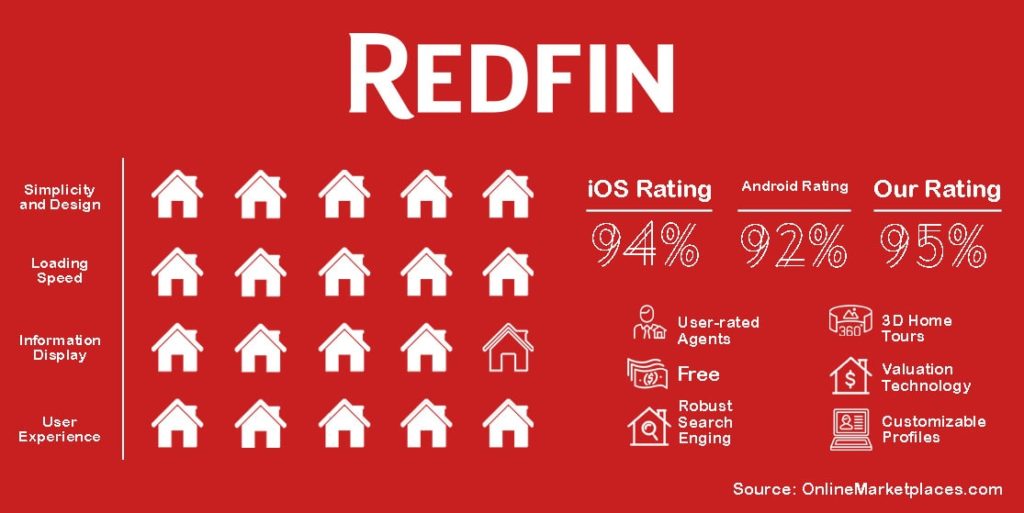
The app's aesthetics are great. Very minimalist and easy to navigate. Redfin is a brokerage with listings hitting the app as quickly as 15 minutes after being posted on the MLS. Active listing prices are said to be more accurate than Zillow, and listings are updated every five minutes. The real pull is Redfin’s ability to use this technology to save users money, whether it’s looking for or selling a home for the best price.
App users can browse through user-rated agents when looking for a real estate professional to help them on their journey. Like many of us, looking through user reviews is one of the best ways to easily gauge how reliable something is. The agents on Redfin are presented just like that, with transparency in the form of real opinions from real users.
The app offers many of the normal features that almost every other property app offers, including customizable search capabilities, customizable profiles, with everything connected to the user’s account so it can be accessed on both mobile and desktop, all for free.
Redfin allows users to schedule and operate home tours through its app for free, as well. They can connect with a Redfin Real Estate Agent through the app, plan out visits, and attend open houses.
Many of the worst ratings are from years ago. Many of which seem to have been resolved either through troubleshooting or with the further update and enhancement of the app itself. More recent reviews either say it’s the best property portal app out there or it's buggy. Very little in-between with only a few offering suggestions for new ways its features could be improved.
Some Android users have complained about the map, stating that it opens a Google map instead of a map specifically for the Redfin app. Others have mentioned bugs but other than that, most say it’s their favorite property portal mobile app making it the highest-rated by Android users in our research so far.
We have to agree with the masses. When using Zillow and then switching to Redfin, the latter offered an overall better experience. The design is more aesthetically pleasing, the app’s loading time is virtually nothing, and the navigation is easy to understand and utilize.
So, when it comes to choosing between using Redfin and Zillow, it really just comes down to personal preference.
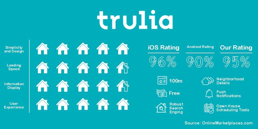
Being a company under the Zillow mega-brand, it’s not surprising that Trulia’s property portal mobile app made it onto the list. Like many of the big-name brands, Trulia is stocked full of features that can help the average homebuyer looking for their next home.
Through the Trulia property portal mobile app, users can browse through over 100 million listings with the help of a highly customizable search engine. Users can draw on a map as a way of telling the program where they would like to live- a feature that is becoming increasingly popular with property portal mobile apps across the globe. Users can also schedule open houses and home tours all in one place via the Trulia app, another service that has gained incredible popularity within the last year due to the Covid crisis.
Trulia’s main focus is its newest feature, Trulia Neighborhoods, where users can browse through 34 neighborhood heat overlap maps that include crime, schools, amenities, and commute. Users can see unique viewpoints of a neighborhood via original photos, local stories, and drone footage. Along with this feature is the What Locals Say feature that offers users a glimpse into the average life of someone living within a specified neighborhood.
The biggest complaint seems to be pertaining to the push notifications feature. Many users who have given the app a poor rating say that they are interrupted with notifications from the app much too often, one even stating they were interrupted while using the app itself. Other than that, the average rating is high enough to rival its parent company and Homesnap.
Android users have given Trulia a higher-than-normal rating, we noticed while doing research. Many of the poorer reviews pertain to bugs and glitches. The development team is diligent in responding and working on these issues quickly and efficiently. Many poorer ratings have edits attached to them thanking the developers for their quick response and action.
Trulia’s app is cute. Opening it for the first time, we were greeted by an adorable animation that is overall aesthetically pleasing. The load times are okay, not horrible, but not great. We did notice some glitches that were reflected in the reviews, especially while using an iphone. There are a lot of popup notifications, thought messing around in the settings can take care of that. Overall, it’s a good property portal mobile app that we would definitely recommend.
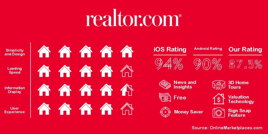
Though its search function might not be as in-depth as the search engines on the Zillow or Redfin apps, realtor.com’s property portal mobile app allows users to compare listings on the other big apps so they can find the best deals.
Realtor.com’s app is connected to the MLS and has a number of interesting features, including Sign Snap, which allows users to take a picture of a for sale sign and instantly get details on that home.
Other features include 3D home tour capabilities, valuation technology, and push notification specifically for price changes on listings, making sure you get notified as soon as a listing you’ve favorited updates.
Users can also utilize Realtor’s noise layer filter and heat map in order to get a better idea of what the pricing is like within a certain area. There is a section for data, news, and insights to offer even more information to users so they can make better-informed decisions when it comes to buying and renting a home.
Most of the recent reviews rave about the simplicity of the app. Users say that the app is easy to navigate and the features aren’t too complicated, still offering great results. The majority of the reviews that offer criticism say the app is better for finding apartments for rent than anything else.
The unique thing about the realtor.com Android app is that the development team is responsive to criticisms left by reviews. Scrolling through the lower-rated reviews, many of them have replies from the development team, asking for verification on issues and actively working to fix them.
That being said, the issues range from certain features not working on the app, but working on the desktop; favorite listings disappearing or the feature itself having issues operating; bogus listings and real estate agents that are sub-par according to various users.
Comparing it to Zillow and Redfin, realtor.com’s app is just okay. There wasn’t anything inherently wrong with the app when it comes to navigation, look and feel, and listing displays that we could glean during our research. It gets the job done but its special features aren’t enough to persuade us to give it a rating higher than 88%.
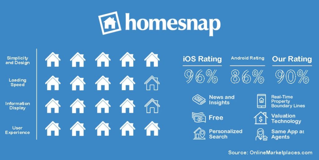
Homesnap’s drawing statement is that it's the same app used by real estate agents, giving the average home buyer, seller, and renter, a feeling that what they’re using is on par with the experts.
There are a number of features offered through the app that are similar to those of its competitors, including personalized search capabilities, price valuation technology, and drawable map views that further assist in the browsing section of the home buying process.
One unique feature is available only via its mobile device apps and that is the real-time property boundary lines feature, which does exactly that. Users can see through the app the boundaries of a property as they walk the premises.
Like realtor.com, Homesnap allows users to snap a photo of a property that’s listed on its platform and receive information about the property instantly through the Homesnap app. Convenient for those running into a listing in public and are curious about the listing’s details.
Homesnap’s app page proudly states it's a top-rated app for iOS and that isn’t a stretch. It rates as highly as Zillow when it comes to Apple users. In fact, most of the recent reviews are about how good the app is. Even the critical ones are about how the app is good but could use some updating. However, one recent review comments on how often and quickly the app updates and how every version of the app is better than the last.
Recent reviews on the Google Play Store for Homesnap’s mobile app are hot and cold. Some have pointed out very serious issues, like the app continuing to charge a user’s credit card even after they’ve canceled the premium subscription. One reviewer went as far as to say the iOS version of the app is infinitely better than the Android version, something that many disgruntled Android users can agree with, if the ratings for these apps have any say about it.
Other issues brought to light pertaining to being unable to copy and paste information into the app, the listing photograph feature only being accurate “95% of the time.” and other small issues that could very well be circumstantial.
Still, Homesnap’s development team is listing as many of these reviews have been replied by the developers looking to solve any problems that are brought up.
Having backing from CoStar Group, Homesnap’s app has definitely improved in recent years. Our only criticism is the loading speed is not comparable to its competitors. When using an app, we tend to have even less patience for loading times than when on a computer. Apps need to be lightning-fast to keep our attention and Homesnap is noticeably slow.
All opinions were made using the iOS versions of each app. Any information on the Google versions of the apps was taken from reviews made by Android users on the Google Play Store pages for each app.